
What We Found
During a recent audit, we navigated to the footer of a site using a screen reader and moved through the social media links. Visually, the icons were immediately recognizable: Facebook, Instagram, YouTube. Standard footer stuff.
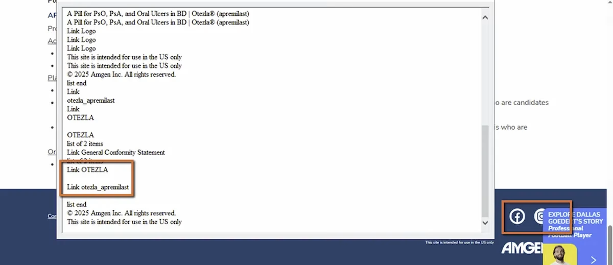
What the screen reader announced was less helpful. Depending on how the links were coded, we heard variations of:
“Link.”“Facebook, link.”“Image, link.”
None of them told the user whose Facebook page, which Instagram account, or what YouTube channel. And some didn’t even identify the platform at all.
WCAG 1.1.1: Non-text Content. WCAG 2.4.4: Link Purpose (In Context). Severity: High.
Why “Facebook, Link” Isn’t Enough
This might seem like a small thing. The user hears “Facebook” and can probably figure out it goes to a Facebook page, right? But think about what’s actually missing.
Whose Facebook page? The brand’s? A parent company’s? A campaign-specific page? If the site represents multiple brands or products, “Facebook, link” doesn’t narrow it down. And if the user pulls up a links list to scan all the links on the page (a common screen reader navigation pattern, covered in Post 7), they might see “Facebook, link” and “Instagram, link” alongside all the other links on the page with no way to know these are official brand social profiles versus any other external link.
There’s also the question of behavior. Does the link open in a new tab? Does it leave the current site? For screen reader users, unexpected navigation to an external platform can be disorienting, especially if they weren’t sure what the link was in the first place.
The bar for WCAG 2.4.4 is that the purpose of each link should be determinable from the link text alone, or from its programmatic context. “Link” with no text fails entirely. “Facebook” without brand context is better but still ambiguous.
This Applies to Every Icon Link, Not Just Social Media
Social media icons in the footer are the most common version of this issue, but the principle applies anywhere an icon is used as the sole content of a link. Share buttons, external resource links, app store badges, partner logos that link out. If the only content inside the anchor tag is an image or SVG with no accessible name, the link’s purpose is unclear.
This ties back to Post 8 in this series about icon buttons. The same principle applies: icons are visual shorthand. Assistive technology needs the longhand version, a text name that explains what the element does or where it goes.
The Fix
Add a descriptive aria-label to each social link and mark the icon as decorative:
<a href="https://facebook.com/BRAND" aria-label="Visit BRAND on Facebook"> <svg aria-hidden="true">...</svg></a>Or use visually hidden text inside the link:
<a href="https://instagram.com/BRAND"> <span class="visually-hidden">Visit BRAND on Instagram</span> <svg aria-hidden="true">...</svg></a>The accessible name should include both the platform and the brand. “Visit BRAND on Facebook” is clear and specific. “Facebook” alone is workable but not ideal. “Link” or nothing is a failure.Make sure each link’s accessible name is unique. If a links list shows “Visit BRAND on Facebook,” “Visit BRAND on Instagram,” and “Visit BRAND on YouTube,” the user can immediately tell them apart and choose confidently.

Learn more about our human-led accessibility solutions that enable access for all
The Bigger Picture
Footer social links are one of those elements that get built once, usually early in a project, and then never revisited. They’re in a template. They’re on every page. And because they’re visually obvious, nobody thinks to test them with a screen reader.
But they’re interactive links. They’re on every page of the site. And they’re often the only way for a user to find the brand’s social presence. If they’re inaccessible, that’s a barrier repeated across the entire site.
The fix takes less than a minute per link. An aria-label or a visually hidden span. That’s it. For something that appears on every page, it’s one of the highest-impact-per-effort fixes available.
Bottom Line
Social media icons look self-explanatory on screen. For screen reader users, they’re only as useful as the text behind them. Every icon link needs a descriptive accessible name that identifies both where it goes and whose presence it leads to. If the link can’t explain itself without the icon, it’s not accessible.