What We Found
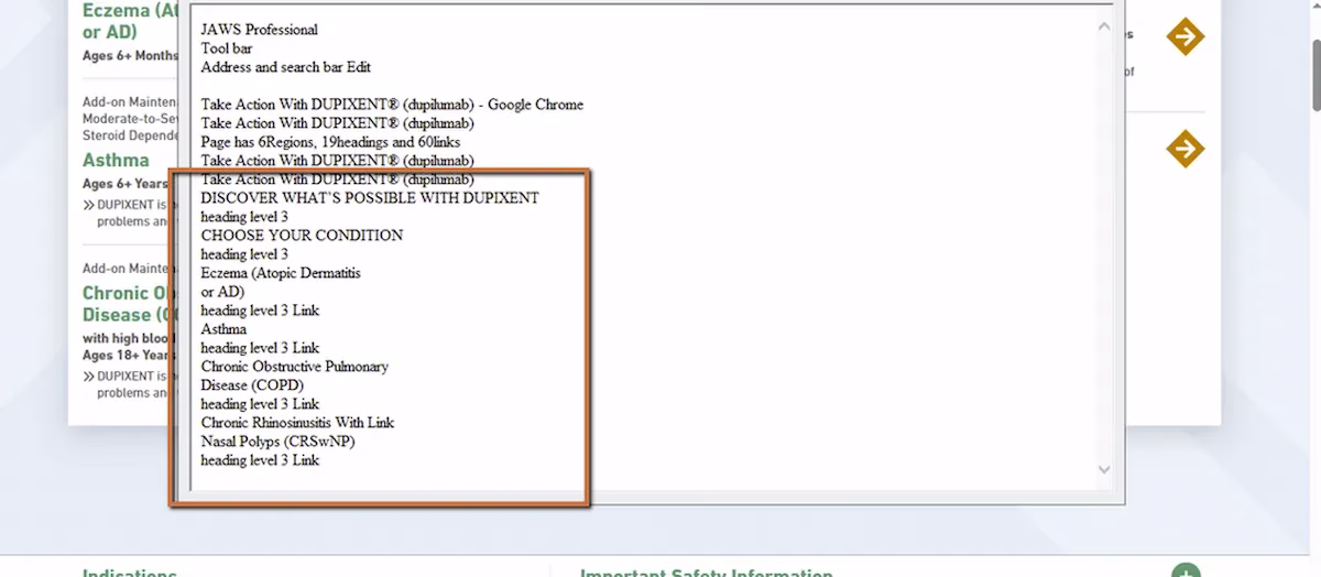
We recently audited a site where the visual layout was clean. Headings, sections, clear hierarchy. Everything looked right on screen. But when we tested with JAWS (a screen reader) on Chrome, the first heading on the page was an H3. There was no H1 anywhere. Subsequent headings skipped levels entirely. And some sections that visually looked like headings weren’t coded as headings at all.
The page looked structured. The code told a different story.
WCAG 1.3.1 Info and Relationships (Severity: High)
Why This Matters
To understand why this is a barrier, you need to know how screen reader users actually navigate a page. They don’t read top to bottom the way sighted users scan visually. They press the “H” key to jump from heading to heading, building a mental outline of the content as they go. It’s fast, efficient, and it’s how most screen reader users orient themselves on content-heavy sites, especially in industries like healthcare, government, and financial services where pages tend to be long and dense.
When that heading structure is broken, the whole system falls apart. If the first heading is an H3, the screen reader is essentially telling the user that two parent levels exist above this point. But they don’t. The user is left guessing where they are on the page.
Imagine opening a printed report that starts at “Section 3.2” but never includes Section 1 or Section 2. The logical flow just collapses. That’s what broken heading hierarchy feels like for someone navigating with a screen reader.
This is categorized as high severity because it doesn’t just make things harder. It can make entire sections of a page effectively invisible to assistive technology users. And it’s one of the most common issues we find in audits.
What Proper Heading Structure Gives Users
When headings are implemented correctly, screen reader users can:
- Pull up a list of every heading on the page instantly
- Jump straight to the section they need without reading everything above it
- Understand the full page organization in seconds
When headings are broken, all of that disappears. Users are left reading line by line through content that sighted users can scan at a glance.
The Fix
The fix is not complicated. The page needs one H1 representing the main topic. H2s for major sections. H3s for subsections within those. No skipping levels. And critically, don’t use heading tags for styling. If you want text to look bigger or bolder, use CSS. Heading tags exist to communicate structure, not appearance.
Here’s what a clean heading structure looks like in code:
<h1>Brand Name</h1><h2>About the Treatment</h2><p>Overview content here.</p><h2>How It Works</h2> <h3>Mechanism of Action</h3><h2>Important Safety Information</h2> <h3>Common Side Effects</h3><!-- H1 → H2 → H3. No skipped levels. -->
Learn more about our human-led accessibility solutions that enable access for all
The Bigger Picture
Accessibility failures often happen not because content is missing, but because the relationships between content aren’t coded correctly. A page can have every piece of information a user needs and still be unusable if the structure doesn’t communicate how that information is organized.
Heading hierarchy is foundational. It’s one of the first things we check in any audit because when it’s wrong, everything downstream suffers: navigation, comprehension, orientation. For users who depend on assistive technology, structural accessibility isn’t cosmetic. It’s architectural.
Bottom Line
Visual structure and semantic structure are two different things. One is what the page looks like. The other is what the page actually communicates to assistive technology. If they don’t match, part of your audience is locked out.