
What We Found
During a recent audit, we increased Chrome’s browser zoom to 400% and opened the site’s hamburger navigation menu.
At default zoom, the menu looked and worked perfectly.
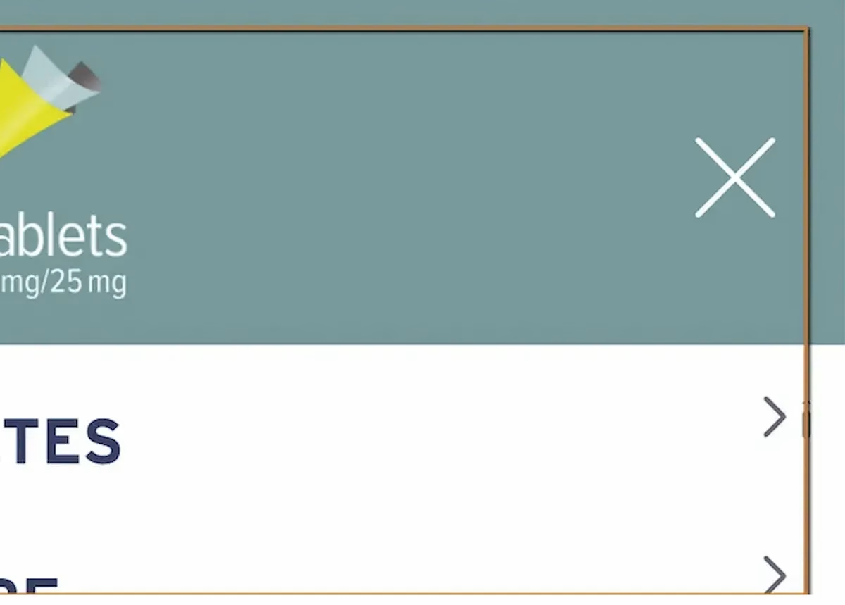
At 400%, several sublinks were clipped horizontally. Portions of the link text were cut off mid-word. The content didn’t reflow to fit the narrower viewport created by high magnification. Instead, the text overflowed its container and became unreadable.
If you can’t read the full text of a navigation link, you can’t know where it goes.
WCAG 1.4.10: Reflow. WCAG 1.4.4: Resize Text (Severity: High)
Why 400% Zoom Matters
This is the barrier type that surprises a lot of teams, because most people test at 100% zoom and maybe check a couple of mobile breakpoints. But a significant number of users with low vision don’t use screen readers.
They use browser zoom.
They enlarge the page until the text is big enough to read, and they navigate the site visually at that magnification.
At 400% zoom, the browser is essentially rendering the page at 320 CSS pixels wide. That’s narrower than most phones. If the layout can’t handle that width, content gets clipped, overlapped, or pushed off-screen.
WCAG 1.4.10 requires that content be presented without loss of information or functionality at this zoom level.
No horizontal scrolling (with limited exceptions like data tables). No truncated text. No content that disappears behind a container edge.
What This Looks Like for a Low-Vision User
Imagine zooming into a site until the text is large enough for you to read comfortably. You open the navigation menu to find a specific page. The first few links are readable. Then you hit one that’s cut off: “Important Safe…” or “Treatment Opt…” You can’t tell what the full link says. You can guess, but you might guess wrong.
Now multiply that across an entire navigation menu on a content-heavy site. Healthcare, government, financial services. Sites where landing on the wrong page isn’t just inconvenient, it could mean missing safety information or policy details.
Navigation is the primary access mechanism for any website. If it breaks under zoom, the user’s ability to find anything on the site is compromised.
Why This Happens
This is almost always a CSS problem. The most common causes are fixed-width containers that don’t adapt when the viewport shrinks, overflow: hidden cutting off content that extends beyond its box, absolute positioning that prevents natural text wrapping, and insufficient responsive breakpoints that don’t account for viewports below 360 or 320 pixels.
When the layout assumes a fixed viewport width, high magnification causes it to collapse. The content is all there in the code, but the visual presentation hides it.
The Fix
The core fix is making sure navigation containers support responsive reflow. Text needs to wrap naturally instead of getting clipped.
.menu-item { white-space: normal; word-wrap: break-word; overflow-wrap: break-word;}.hamburger-menu { max-width: 100%;}.menu-container { display: flex; flex-direction: column;}Media queries should account for narrow viewports:
@media (max-width: 320px) { .menu-item { font-size: 1rem; line-height: 1.4; }}Avoid fixed pixel widths for containers. Use relative units like percentages, em, or rem. And test at 400% zoom on desktop, not just on mobile devices, because the viewport math is different.

Learn more about our human-led accessibility solutions that enable access for all
The Bigger Picture
Zoom testing is one of the most overlooked parts of accessibility QA. Teams test with screen readers, run automated scans, check color contrast, but rarely zoom the page to 400% and try to use it. When they do, issues like this surface immediately.
Responsive design and accessibility overlap heavily at high zoom levels. A lot of the work teams are already doing for mobile responsiveness gets them most of the way there. But “most of the way” still leaves gaps, especially in components like navigation menus, dropdowns, and flyouts that behave differently at extreme widths.
Content should adapt to the viewport, not collapse. If zooming in degrades the experience, that’s a barrier.
Bottom Line
A navigation menu that works at 100% zoom but breaks at 400% is locking out users with low vision. These users aren’t edge cases. They’re people who rely on magnification every time they use the web. Reflow isn’t optional. It’s how you make sure content stays usable no matter how someone needs to view it.
400% zoom simulates how many low-vision users browse the web. At this level, content must remain readable and functional without horizontal scrolling, as required by WCAG guidelines.
At 400% zoom, navigation links can become clipped or cut off, making it difficult or impossible for users to understand where links lead.
Common causes include fixed-width layouts, improper use of CSS (like overflow: hidden), and lack of responsive design for very narrow viewports.
Ensure responsive design with flexible layouts, allow text wrapping, avoid fixed widths, and test navigation at 400% zoom to confirm content reflows properly.