
What We Found
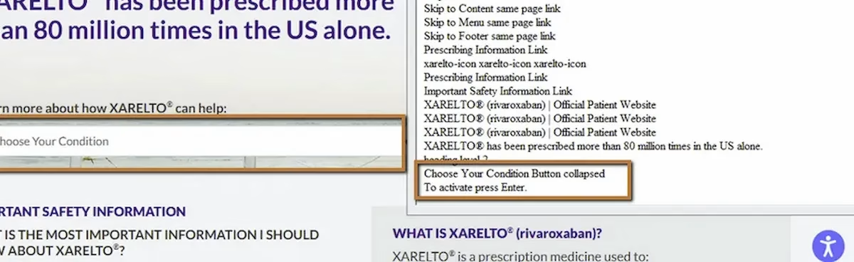
During a recent audit, we navigated a form using a screen reader. When focus landed on a combo box (a dropdown-style selection control), the announcement was:
“Combo box.”
No label. No context. No indication of what the user was being asked to select. Was it a dosage? A location? A plan type? A language preference? There was no way to tell.
Visually, nearby text on the page made it clear what the field was for. But assistive technology doesn’t read visual proximity. It reads programmatic associations. And there weren’t any.
WCAG 3.3.2: Labels or Instructions/WCAG 3.3.1: Error Identification (Severity: High)
Why Combo Boxes Are Especially Problematic When Unlabeled
We’ve covered unlabeled form fields earlier in this series, but combo boxes deserve their own attention. They’re more complex than a simple text input because they involve selection from a predefined list of options. When a text input is unlabeled, the user might type something and see what happens. When a combo box is unlabeled, the user is choosing from options they may not understand the context for.
Consider a healthcare site where a combo box lets users select a dosage or a condition. If the label is missing, the user sees a list of options but doesn’t know what question those options are answering. They might select something that seems right and move on, never realizing they answered the wrong question.
This gets worse when validation kicks in. WCAG 3.3.1 requires that errors be identifiable. If the user submits the form and a validation error fires on the combo box, the error message needs to reference the field clearly. But if the field itself has no label, the error message either inherits that ambiguity or points to a control the user still can’t identify. Error recovery becomes a guessing game stacked on top of an already confusing interaction.
Native vs. Custom Combo Boxes
This issue shows up in two different ways depending on whether the combo box is built with native HTML or as a custom component.
With a native select element, the fix is usually just a missing label association. The control itself handles keyboard interaction, role announcement, and state communication automatically. You just need to connect a label to it.
Custom combo boxes built with divs, spans, and JavaScript are a different story. They need everything wired manually: the combobox role, aria-expanded state, an accessible name, keyboard handling for arrow keys and Escape, and a connected listbox with option roles. When any of those pieces are missing, the control doesn’t just lack a label. It can lack role, state, and keyboard access all at once.
This connects back to the Name, Role, Value principle from Post 3 and the keyboard accessibility issues from Post 4 in this series. Custom form controls compound accessibility failures because there’s more that can go wrong.
The Fix
For native select elements, associate a label:
<label for="brand-selection">Select an option</label><select id="brand-selection"> <option value="1">Option 1</option> <option value="2">Option 2</option></select>If the design calls for a hidden label:
<label for="brand-selection" class="visually-hidden"> Select an option</label><select id="brand-selection"> <option value="1">Option 1</option> <option value="2">Option 2</option></select>For custom combo box components, ensure the accessible name and ARIA attributes are in place:
<div role="combobox" aria-label="Select dosage" aria-expanded="false" aria-controls="dosage-list" tabindex="0"></div><ul role="listbox" id="dosage-list"> <li role="option">10mg</li> <li role="option">25mg</li> <li role="option">50mg</li></ul>Whenever possible, use the native select element. It does most of the work for you.

Learn more about our human-led accessibility solutions that enable access for all
The Bigger Picture
Forms are where users take action: signing up, making selections, submitting information, completing tasks. Every unlabeled control in a form is a point where that action can break down. Combo boxes are higher stakes because they involve choice from constrained options, and an incorrect choice made without context can cascade into errors downstream.
The pattern across this series keeps coming back to the same principle: assistive technology interprets code, not layout. If the relationship between a label and a control isn’t in the code, it doesn’t exist for screen reader users. This is true for text inputs, search fields, dropdowns, combo boxes, and every other form control.
Bottom Line
A combo box that announces as just “combo box” is asking the user to make a selection without telling them what they’re selecting. Add a label. Associate it programmatically. And if you’re using a custom component, make sure the full accessible experience is there: name, role, value, state, and keyboard support. Forms only work when every control identifies itself.
Labels provide context for what the user is selecting. Without a label, screen reader users only hear “combo box,” making it impossible to understand the purpose of the field.
Users may select incorrect options because they don’t know what question the dropdown is asking, leading to errors and confusion during form submission.
Assistive technologies rely on programmatic labels, not visual placement. If a label isn’t properly associated in the code, the field has no meaning for the user.
Use properly associated <label> elements for native dropdowns or add ARIA attributes for custom components to ensure name, role, and functionality are clearly defined.