
What We Found
During a recent audit, we navigated a page using a screen reader’s heading shortcut, pressing “H” to jump from heading to heading and build a mental outline of the content. The page looked well organized. Bold, large-font section titles were clearly visible, breaking the content into logical sections.
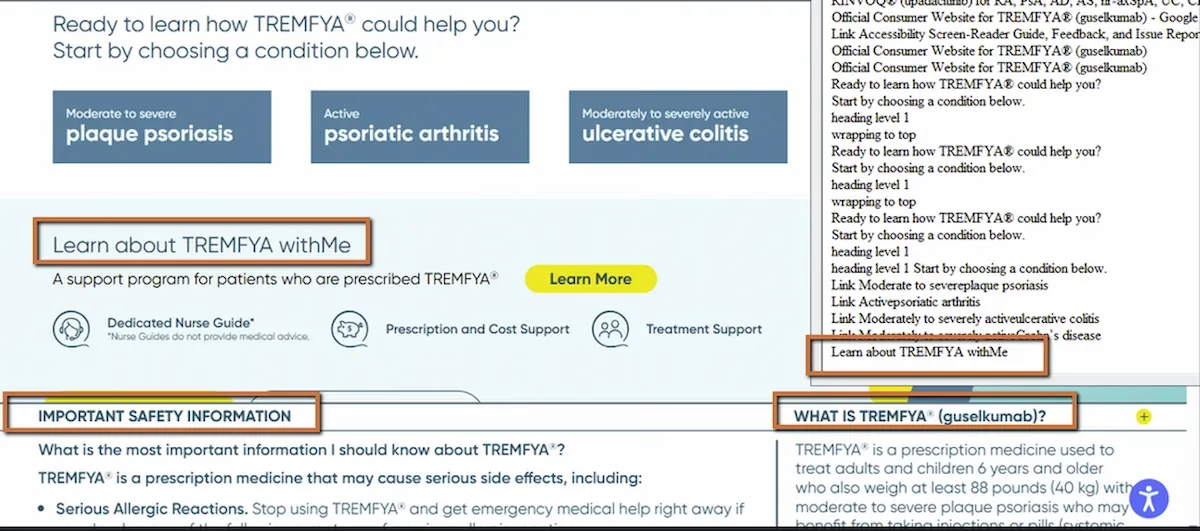
But when we jumped through headings, major sections were missing from the sequence. The screen reader skipped right past them. When we inspected the code, we found the reason: those visually prominent titles weren’t coded as headings at all. They were divs and spans styled with CSS to look like headings.
For sighted users, the page had clear structure. For screen reader users, the page was flat.
WCAG 1.3.1: Info and Relationships. Severity: Medium.
How This Differs From Broken Heading Hierarchy
Earlier in this series (Post 1), we covered heading hierarchy failure, where headings existed in the code but skipped levels or started at the wrong level. That’s a structural problem with headings that are present but poorly organized.
This is a different issue. Here, the headings aren’t present in the code at all. The visual design communicates hierarchy through font size, weight, and spacing. The HTML communicates nothing. A styled div might look exactly like an H2 on screen, but assistive technology can’t tell the difference between a div that says “Treatment Overview” in 24px bold and a div that says “lorem ipsum” in the same styling. Neither one registers as a heading.
WCAG 1.3.1 is direct about this: information and relationships conveyed through visual presentation must also be conveyed programmatically. If it looks like a heading, it needs to be coded as a heading.
Why This Matters for Real Navigation
Screen reader users rely heavily on heading navigation for the same reason sighted users rely on visual scanning. On a content-heavy page, especially in healthcare, government, or financial services, nobody reads top to bottom. Sighted users scan for bold section titles and jump to what’s relevant. Screen reader users press “H” to do the same thing.
When major sections aren’t coded as headings, they disappear from that navigation. The user either has to read the entire page linearly or pull up a heading list that’s missing half the sections. On long pages, this can mean the difference between finding information in seconds and spending minutes searching, or missing it entirely.
Screen readers also let users generate a full outline of all headings on a page. When headings are properly coded, that outline acts like a table of contents. When section titles are just styled divs, the outline has gaps that make the page structure incomprehensible.
The Fix
Replace styled containers with proper heading tags. That’s it.
<div class="section-title">Treatment Overview</div>Use:
<h2>Treatment Overview</h2>For nested sections:
<h2>About the Treatment</h2><h3>How It Works</h3><h3>Safety Information</h3>If you need the heading to look different from the browser’s default heading styles, use CSS. That’s what CSS is for. Style and structure are separate concerns:
h2 { font-size: 2rem; font-weight: bold;}Don’t pick heading levels based on how you want the text to look. Pick them based on the content’s logical hierarchy, then style them with CSS to match the design.
Why This Happens So Often
This is usually a workflow issue more than a knowledge issue. Designers create mockups with clear visual hierarchy. Developers implement the visual design using whatever HTML elements are convenient, often divs with class names like “section-title” or “heading-large.” The page looks right, so it ships.
The disconnect is that nobody in the process explicitly maps the visual hierarchy to semantic HTML. It’s not that teams don’t know what heading tags are. It’s that the step of matching visual structure to code structure gets skipped when it’s not part of the QA checklist.

Learn more about our human-led accessibility solutions that enable access for all
The Bigger Picture
This issue sits at the core of what semantic HTML means. Semantic markup isn’t about making the page look a certain way. It’s about telling the browser, assistive technology, and search engines what the content actually is. A heading tag says “this is a section boundary.” A div says nothing.
When semantic structure matches visual structure, every user gets the same understanding of how the page is organized, whether they’re seeing it or hearing it. When it doesn’t match, the page works for one group and fails for another.
Bottom Line
If it looks like a heading, code it as a heading. Visual styling and semantic structure need to agree. A bold, large-font section title in a div is invisible to assistive technology. The same text in an H2 is a navigational landmark. The difference is one HTML tag.
Because screen readers rely on HTML heading tags to understand page structure. Styled text without proper tags is invisible to assistive technology.
They may look correct visually, but screen readers won’t recognize them, making navigation difficult and removing key sections from the page outline.
They use shortcut keys to jump between headings or generate a list of all headings, helping them quickly find relevant content.
Use proper semantic HTML (<h1>–<h6>) for headings and apply CSS for styling instead of using divs or spans to mimic headings.