
What We Found
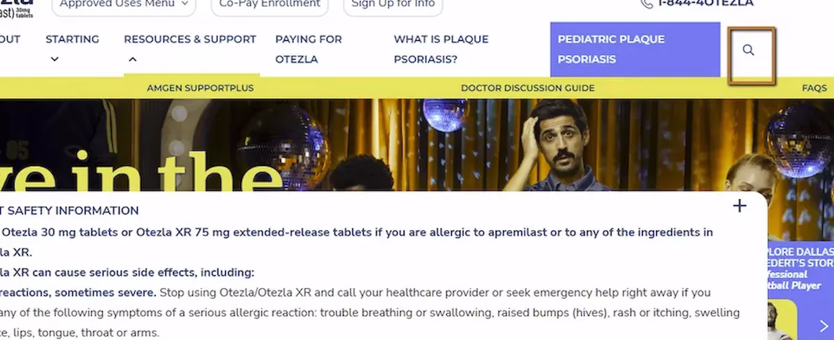
During a recent audit, we encountered icon-only buttons on a site: a magnifying glass for search, an “X” to close a dialog. Standard stuff. Visually, their purpose feels obvious. Most sighted users wouldn’t think twice.
But when we navigated to these controls with a screen reader, all we got was:
“Button.”
No name. No description. No indication of what the button does. The screen reader knew it was a button. It had no idea what kind.
For a sighted user, an unlabeled icon button is a minor annoyance at worst. For a screen reader user, it’s a guessing game. Do I click this and hope it searches? Do I click this and hope it closes the dialog instead of deleting something? There’s no way to know without trying.
WCAG 4.1.2: Name, Role, Value. Severity: High.
Why Icons Don’t Speak for Themselves
There’s a common assumption in design that certain icons are universally understood. A magnifying glass means search. An “X” means close. A hamburger icon means menu. And visually, that’s mostly true for sighted users who’ve spent years building those associations.
Assistive technology doesn’t work that way. A screen reader doesn’t look at an SVG and interpret its shape. It reads the accessibility tree, which is the programmatic representation of the page. If a button has no accessible name in that tree, the screen reader has nothing to announce beyond the element’s role.
This is the same Name, Role, Value principle from earlier in this series (Post 3). The role is partially there (“button”). The name is missing. Without a name, the control has no meaning.
Where This Gets Especially Problematic
Icon buttons tend to control important actions. Search, close, navigation, settings, account menus, shopping carts. These aren’t decorative elements. They’re primary interaction points.
Consider a close button inside a modal dialog. If it has no accessible name, a screen reader user who’s been properly focused into the modal (see Post 5 in this series) still can’t identify how to exit it. They’re trapped in a dialog with no labeled way out.
Or consider a search icon button. Without a name, a screen reader user navigating the header hears “button” and has to decide whether to activate an unknown control. On a healthcare or financial services site, that kind of ambiguity undermines trust.
The Fix
This is one of the fastest fixes in accessibility. Add an aria-label to the button and mark the icon as decorative:
<button aria-label="Search"> <svg aria-hidden="true">...</svg></button><button aria-label="Close dialog"> <svg aria-hidden="true">...</svg></button>The aria-hidden=”true” on the SVG is important. It tells the screen reader to ignore the icon itself and rely on the button’s accessible name instead. Without it, some screen readers might try to announce the SVG content, which usually produces gibberish or nothing useful.If you prefer not to use aria-label, visually hidden text inside the button works too:
<button> <span class="visually-hidden">Close dialog</span> <svg aria-hidden="true">...</svg></button>A few things to avoid: don’t rely on the title attribute as the primary accessible name, since screen reader support for title is inconsistent. Don’t assume that a tooltip appearing on hover solves the problem, because tooltips are a visual-only feature. And don’t leave the SVG exposed without aria-hidden, since it can interfere with name computation.

Learn more about our human-led accessibility solutions that enable access for all
The Bigger Picture
Icon buttons are everywhere in modern interfaces. Minimalist design trends have pushed teams toward fewer visible labels and more icon-only controls. That’s fine visually. But every icon that replaces a text label is a potential accessibility gap if the accessible name isn’t added.
The good news is this is one of the simplest issues to fix and one of the easiest to catch. A quick pass through the page with a screen reader, or even just inspecting the accessibility tree in Chrome DevTools, will flag every unnamed button immediately.
One aria-label per icon button. That’s it. The effort is minimal. The impact is significant.
Bottom Line
An icon is visual shorthand. An accessible name is what translates that shorthand into something assistive technology can communicate. Without it, the button is just a mystery the user is expected to click on faith. Every icon button needs a name. No exceptions.
Because screen readers cannot interpret icons visually. Without a label, users only hear “button,” with no indication of its function.
Users must guess its purpose, which can lead to confusion, errors, or inability to complete key actions like closing a dialog or starting a search.
They rely on the accessibility tree, which requires a clear name, role, and value. Without a name, the button lacks meaning.
Add an aria-label or include visually hidden text inside the button, and mark the icon as decorative using aria-hidden="true".