
What We Found
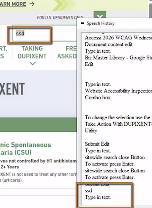
We recently audited a site where the search field looked perfectly normal. There was an icon, placeholder text, the whole setup. Sighted users would have no trouble identifying it. But when we tested with JAWS (a screen reader) on Chrome, navigating to the input field produced a single announcement:
“Edit.”
That’s it. No “Search.” No context. No indication of what the field is for. For a blind user, this is the equivalent of encountering a blank, unlabeled box on the page with no explanation.
WCAG 3.3.2 Labels or Instructions (Severity: High)
Why This Matters
Screen reader users don’t interpret visual cues the way sighted users do. They can’t see the magnifying glass icon sitting next to the input. They can’t rely on the layout to infer that a text field near the top of the page is probably search. Assistive technology depends entirely on what’s coded in the DOM, specifically on programmatic relationships between labels and inputs.
When a form field has no accessible name, the user has to guess what it does. They might tab past it. They might type something in and hope for the best. They might explore the surrounding content manually to try and figure out the context, which takes time and adds cognitive load.
This is especially problematic on content-heavy sites in healthcare, government, and financial services where search is often the fastest way to find specific information. If the search field is inaccessible, users with disabilities may not be able to locate safety information, policy details, or critical content at all.
A Common Misconception About Placeholder Text
A lot of teams assume that placeholder text inside the input (“Search…”) solves this problem. It doesn’t. Placeholder text disappears the moment someone starts typing, and more importantly, assistive technologies don’t always treat it as a reliable accessible name. It’s a hint for sighted users, not a substitute for a real label.
The Fix
There are a few ways to solve this, depending on design constraints. The cleanest approach is a visible label associated with the input:
<label for="search-field">Search</label><input id="search-field" type="text" />If the design requires hiding the label visually, you can use a visually-hidden class that keeps the label available to assistive technology:
<label for="search-field" class="visually-hidden">Search</label><input id="search-field" type="text" />You can also use ARIA attributes:
<input type="text" aria-label="Search" />Or reference visible text elsewhere on the page:
<span id="search-text">Search</span><input type="text" aria-labelledby="search-text" />The method matters less than the outcome: the input needs to expose a meaningful, accessible name.

Learn more about our human-led accessibility solutions that enable access for all
The Bigger Picture
This issue comes up constantly in audits. Search fields, filter dropdowns, icon-only buttons. Teams build custom components that look great and function perfectly for sighted users, but skip the one line of code that makes the element identifiable to assistive technology.
Accessibility isn’t about adding extra features on top of what’s already there. It’s about making sure core functionality works for everyone. A search field is core functionality. If a user can’t identify what it is, the form is broken for them, full stop.
Bottom Line
Every interactive element on a page needs to expose a clear, programmatic name. Visual cues like icons and placeholder text help sighted users, but they do nothing for someone navigating with a screen reader. Label association isn’t optional. It’s required for the interface to function equally.
A label gives the input field a clear purpose. Without it, screen readers only announce “edit,” leaving users without context about what the field is for.
No, placeholder text is not a reliable label. It disappears when typing begins and may not be properly announced by assistive technologies.
Users may not recognize the field as a search function, making it harder to find information and increasing confusion and navigation time.
Add a properly associated <label>, use a visually hidden label if needed, or apply ARIA attributes like aria-label to provide a clear accessible name.